
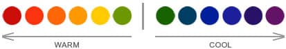
Understanding warm and cool colors can instantly give a painting a sense of harmony.
The color choices an artist makes or breaks a painting, and speaks to their artistic knowledge and skill in properly balancing color temperatures which provides a sense of overall balance and completeness.

In the above Ginette Callaway painting ‘Hummingbird Dances in Red and Pink Bee Balm’, Ginette has almost split the color wheel in half in her composition. If you were to put a diagonal line straight through the middle of her painting, the cool tones of the blues, greens and purples would be dominant on the right and the warm tones of reds, oranges and yellows on the left.
If you squint you eyes at the picture the general color scheme is based on blue and yellow which are opposite each other in the color wheel so are known as complimentary colors.
Ginette manages to balance the scene by placing areas of these two complementary colors, blue and yellow, throughout the composition creating not just harmony but vibrancy also.

In the above Ginette Callaway commissioned painting ‘Assisi Rocca Maggiore Umbria Italy’, the reference photo her collector provided for this work (top right) is cut off at the top which can give the viewer a uneasy or boxed in feeling as if looking through a keyhole, and how it seems flat and unrealistically pale in color.
Ginette balanced the scene by placing areas of these two complementary colors, blue and yellow, throughout the composition creating not just harmony but vibrancy, depth and openness.
In this piece, Ginette used warm & cool complimentary colors to move the viewers eye around this painting as well as enhance the viewer's perspective and overall feeling when viewing this scene.
Ginette has overcome the imperfections in the provided photo by applying positive color temperature balance throughout this impressionistic oil painting of Assisi Rocca Maggiore Umbria Italy .
Gallery http://www.finearthomedecor.com/
- Original Impressionist Oil Paintings
- Original Impressionist Watercolor Paintings
- Original Impressionist Acrylic Paintings
- Original Impressionist Mixed Media Paintings
Twitter - https://twitter.com/FineArtHomeDeco
Blog http://finearthomedecor.blogspot.com/
Facebook: http://www.facebook.com/pages/Fine-Art-Home-Decor/178258498984722
Google Search: https://www.google.com/webhp?sourceid=chrome-instant&rlz=1C1CHMO_enUS521US521&ion=1&ie=UTF-8#hl=en&rlz=1C1CHMO_enUS521US521&sclient=psy-ab&q=%22www.originalfinearthomedecorpaintings.com%22&oq=&gs_l=&pbx=1&fp=53ae6be42ff22c9e&ion=1&bav=on.2,or.r_gc.r_pw.r_cp.r_qf.&bvm=bv.42768644,d.b2I&biw=1163&bih=595
No comments:
Post a Comment